Author: Jason Brownlee
Most imbalanced classification problems involve two classes: a negative case with the majority of examples and a positive case with a minority of examples.
Two diagnostic tools that help in the interpretation of binary (two-class) classification predictive models are ROC Curves and Precision-Recall curves.
Plots from the curves can be created and used to understand the trade-off in performance for different threshold values when interpreting probabilistic predictions. Each plot can also be summarized with an area under the curve score that can be used to directly compare classification models.
In this tutorial, you will discover ROC Curves and Precision-Recall Curves for imbalanced classification.
After completing this tutorial, you will know:
- ROC Curves and Precision-Recall Curves provide a diagnostic tool for binary classification models.
- ROC AUC and Precision-Recall AUC provide scores that summarize the curves and can be used to compare classifiers.
- ROC Curves and ROC AUC can be optimistic on severely imbalanced classification problems with few samples of the minority class.
Let’s get started.

ROC Curves and Precision-Recall Curves for Imbalanced Classification
Photo by Nicholas A. Tonelli, some rights reserved.
Tutorial Overview
This tutorial is divided into four parts; they are:
- Review of the Confusion Matrix
- ROC Curves and ROC AUC
- Precision-Recall Curves and AUC
- ROC and Precision-Recall Curves With a Severe Imbalance
Review of the Confusion Matrix
Before we dive into ROC Curves and PR Curves, it is important to review the confusion matrix.
For imbalanced classification problems, the majority class is typically referred to as the negative outcome (e.g. such as “no change” or “negative test result“), and the minority class is typically referred to as the positive outcome (e.g. “change” or “positive test result“).
The confusion matrix provides more insight into not only the performance of a predictive model, but also which classes are being predicted correctly, which incorrectly, and what type of errors are being made.
The simplest confusion matrix is for a two-class classification problem, with negative (class 0) and positive (class 1) classes.
In this type of confusion matrix, each cell in the table has a specific and well-understood name, summarized as follows:
| Positive Prediction | Negative Prediction
Positive Class | True Positive (TP)  | False Negative (FN)
Negative Class | False Positive (FP) | True Negative (TN)
The metrics that make up the ROC curve and the precision-recall curve are defined in terms of the cells in the confusion matrix.
Now that we have brushed up on the confusion matrix, let’s take a closer look at the ROC Curves metric.
ROC Curves and ROC AUC
An ROC curve (or receiver operating characteristic curve) is a plot that summarizes the performance of a binary classification model on the positive class.
The x-axis indicates the False Positive Rate and the y-axis indicates the True Positive Rate.
- ROC Curve: Plot of False Positive Rate (x) vs. True Positive Rate (y).
The true positive rate is a fraction calculated as the total number of true positive predictions divided by the sum of the true positives and the false negatives (e.g. all examples in the positive class). The true positive rate is referred to as the sensitivity or the recall.
- TruePositiveRate = TruePositives / (TruePositives + False Negatives)
The false positive rate is calculated as the total number of false positive predictions divided by the sum of the false positives and true negatives (e.g. all examples in the negative class).
- FalsePositiveRate = FalsePositives / (FalsePositives + TrueNegatives)
We can think of the plot as the fraction of correct predictions for the positive class (y-axis) versus the fraction of errors for the negative class (x-axis).
Ideally, we want the fraction of correct positive class predictions to be 1 (top of the plot) and the fraction of incorrect negative class predictions to be 0 (left of the plot). This highlights that the best possible classifier that achieves perfect skill is the top-left of the plot (coordinate 0,1).
- Perfect Skill: A point in the top left of the plot.
The threshold is applied to the cut-off point in probability between the positive and negative classes, which by default for any classifier would be set at 0.5, halfway between each outcome (0 and 1).
A trade-off exists between the TruePositiveRate and FalsePositiveRate, such that changing the threshold of classification will change the balance of predictions towards improving the TruePositiveRate at the expense of FalsePositiveRate, or the reverse case.
By evaluating the true positive and false positives for different threshold values, a curve can be constructed that stretches from the bottom left to top right and bows toward the top left. This curve is called the ROC curve.
A classifier that has no discriminative power between positive and negative classes will form a diagonal line between a False Positive Rate of 0 and a True Positive Rate of 0 (coordinate (0,0) or predict all negative class) to a False Positive Rate of 1 and a True Positive Rate of 1 (coordinate (1,1) or predict all positive class). Models represented by points below this line have worse than no skill.
The curve provides a convenient diagnostic tool to investigate one classifier with different threshold values and the effect on the TruePositiveRate and FalsePositiveRate. One might choose a threshold in order to bias the predictive behavior of a classification model.
It is a popular diagnostic tool for classifiers on balanced and imbalanced binary prediction problems alike because it is not biased to the majority or minority class.
ROC analysis does not have any bias toward models that perform well on the majority class at the expense of the majority class—a property that is quite attractive when dealing with imbalanced data.
— Page 27, Imbalanced Learning: Foundations, Algorithms, and Applications, 2013.
We can plot a ROC curve for a model in Python using the roc_curve() scikit-learn function.
The function takes both the true outcomes (0,1) from the test set and the predicted probabilities for the 1 class. The function returns the false positive rates for each threshold, true positive rates for each threshold and thresholds.
...
# calculate roc curve
fpr, tpr, thresholds = roc_curve(testy, pos_probs)
Most scikit-learn models can predict probabilities by calling the predict_proba() function.
This will return the probabilities for each class, for each sample in a test set, e.g. two numbers for each of the two classes in a binary classification problem. The probabilities for the positive class can be retrieved as the second column in this array of probabilities.
...
# predict probabilities
yhat = model.predict_proba(testX)
# retrieve just the probabilities for the positive class
pos_probs = yhat[:, 1]
We can demonstrate this on a synthetic dataset and plot the ROC curve for a no skill classifier and a Logistic Regression model.
The make_classification() function can be used to create synthetic classification problems. In this case, we will create 1,000 examples for a binary classification problem (about 500 examples per class). We will then split the dataset into a train and test sets of equal size in order to fit and evaluate the model.
...
# generate 2 class dataset
X, y = make_classification(n_samples=1000, n_classes=2, random_state=1)
# split into train/test sets
trainX, testX, trainy, testy = train_test_split(X, y, test_size=0.5, random_state=2)
A Logistic Regression model is a good model for demonstration because the predicted probabilities are well-calibrated, as opposed to other machine learning models that are not developed around a probabilistic model, in which case their probabilities may need to be calibrated first (e.g. an SVM).
...
# fit a model
model = LogisticRegression(solver='lbfgs')
model.fit(trainX, trainy)
The complete example is listed below.
# example of a roc curve for a predictive model
from sklearn.datasets import make_classification
from sklearn.linear_model import LogisticRegression
from sklearn.model_selection import train_test_split
from sklearn.metrics import roc_curve
from matplotlib import pyplot
# generate 2 class dataset
X, y = make_classification(n_samples=1000, n_classes=2, random_state=1)
# split into train/test sets
trainX, testX, trainy, testy = train_test_split(X, y, test_size=0.5, random_state=2)
# fit a model
model = LogisticRegression(solver='lbfgs')
model.fit(trainX, trainy)
# predict probabilities
yhat = model.predict_proba(testX)
# retrieve just the probabilities for the positive class
pos_probs = yhat[:, 1]
# plot no skill roc curve
pyplot.plot([0, 1], [0, 1], linestyle='--', label='No Skill')
# calculate roc curve for model
fpr, tpr, _ = roc_curve(testy, pos_probs)
# plot model roc curve
pyplot.plot(fpr, tpr, marker='.', label='Logistic')
# axis labels
pyplot.xlabel('False Positive Rate')
pyplot.ylabel('True Positive Rate')
# show the legend
pyplot.legend()
# show the plot
pyplot.show()
Running the example creates the synthetic dataset, splits into train and test sets, then fits a Logistic Regression model on the training dataset and uses it to make a prediction on the test set.
The ROC Curve for the Logistic Regression model is shown (orange with dots). A no skill classifier as a diagonal line (blue with dashes).
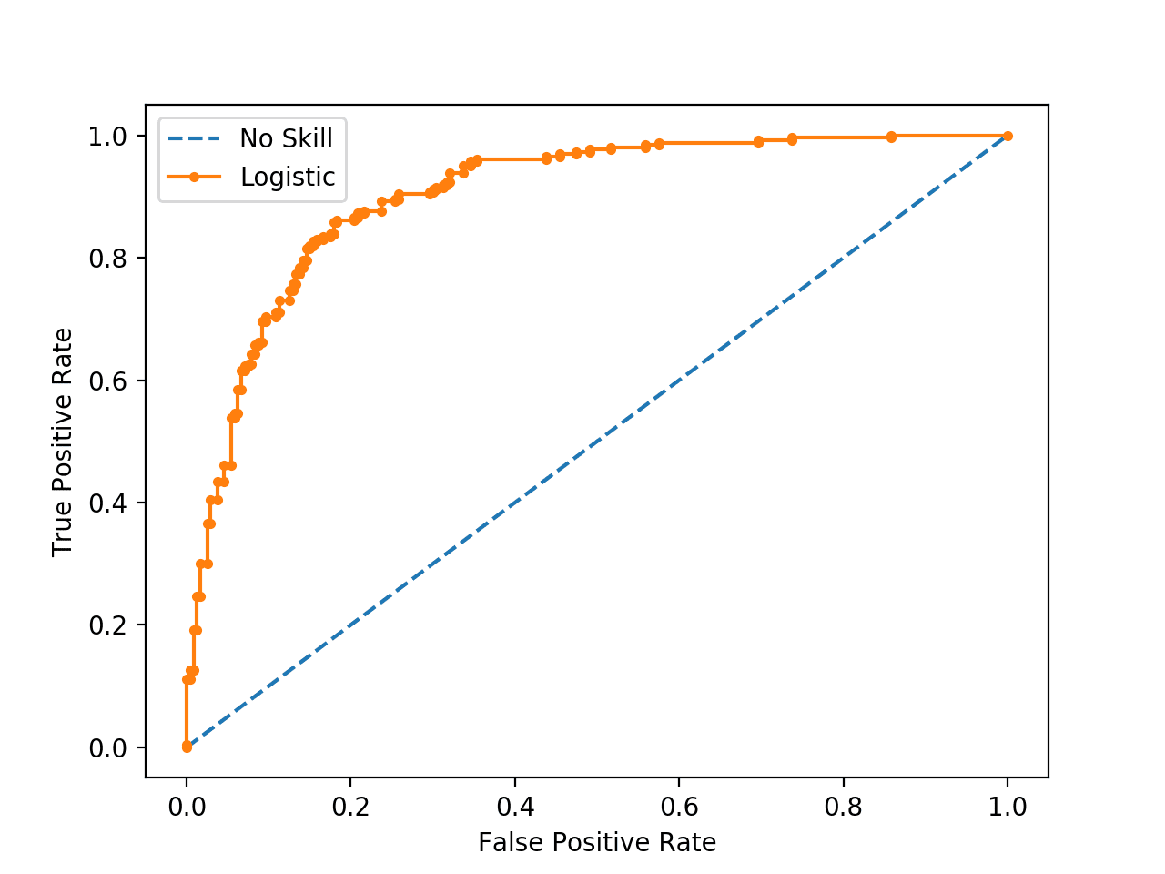
ROC Curve of a Logistic Regression Model and a No Skill Classifier
Now that we have seen the ROC Curve, let’s take a closer look at the ROC area under curve score.
ROC Area Under Curve (AUC) Score
Although the ROC Curve is a helpful diagnostic tool, it can be challenging to compare two or more classifiers based on their curves.
Instead, the area under the curve can be calculated to give a single score for a classifier model across all threshold values. This is called the ROC area under curve or ROC AUC or sometimes ROCAUC.
The score is a value between 0.0 and 1.0 for a perfect classifier.
AUCROC can be interpreted as the probability that the scores given by a classifier will rank a randomly chosen positive instance higher than a randomly chosen negative one.
— Page 54, Learning from Imbalanced Data Sets, 2018.
This single score can be used to compare binary classifier models directly. As such, this score might be the most commonly used for comparing classification models for imbalanced problems.
The most common metric involves receiver operation characteristics (ROC) analysis, and the area under the ROC curve (AUC).
— Page 27, Imbalanced Learning: Foundations, Algorithms, and Applications, 2013.
The AUC for the ROC can be calculated in scikit-learn using the roc_auc_score() function.
Like the roc_curve() function, the AUC function takes both the true outcomes (0,1) from the test set and the predicted probabilities for the positive class.
...
# calculate roc auc
roc_auc = roc_auc_score(testy, pos_probs)
We can demonstrate this the same synthetic dataset with a Logistic Regression model.
The complete example is listed below.
# example of a roc auc for a predictive model
from sklearn.datasets import make_classification
from sklearn.dummy import DummyClassifier
from sklearn.linear_model import LogisticRegression
from sklearn.model_selection import train_test_split
from sklearn.metrics import roc_auc_score
# generate 2 class dataset
X, y = make_classification(n_samples=1000, n_classes=2, random_state=1)
# split into train/test sets
trainX, testX, trainy, testy = train_test_split(X, y, test_size=0.5, random_state=2)
# no skill model, stratified random class predictions
model = DummyClassifier(strategy='stratified')
model.fit(trainX, trainy)
yhat = model.predict_proba(testX)
pos_probs = yhat[:, 1]
# calculate roc auc
roc_auc = roc_auc_score(testy, pos_probs)
print('No Skill ROC AUC %.3f' % roc_auc)
# skilled model
model = LogisticRegression(solver='lbfgs')
model.fit(trainX, trainy)
yhat = model.predict_proba(testX)
pos_probs = yhat[:, 1]
# calculate roc auc
roc_auc = roc_auc_score(testy, pos_probs)
print('Logistic ROC AUC %.3f' % roc_auc)
Running the example creates and splits the synthetic dataset, fits the model, and uses the fit model to predict probabilities on the test dataset.
In this case, we can see that the ROC AUC for the Logistic Regression model on the synthetic dataset is about 0.903, which is much better than a no skill classifier with a score of about 0.5.
No Skill ROC AUC 0.509
Logistic ROC AUC 0.903
Although widely used, the ROC AUC is not without problems.
For imbalanced classification with a severe skew and few examples of the minority class, the ROC AUC can be misleading. This is because a small number of correct or incorrect predictions can result in a large change in the ROC Curve or ROC AUC score.
Although ROC graphs are widely used to evaluate classifiers under presence of class imbalance, it has a drawback: under class rarity, that is, when the problem of class imbalance is associated to the presence of a low sample size of minority instances, as the estimates can be unreliable.
— Page 55, Learning from Imbalanced Data Sets, 2018.
A common alternative is the precision-recall curve and area under curve.
Precision-Recall Curves and AUC
Precision is a metric that quantifies the number of correct positive predictions made.
It is calculated as the number of true positives divided by the total number of true positives and false positives.
- Precision = TruePositives / (TruePositives + FalsePositives)
The result is a value between 0.0 for no precision and 1.0 for full or perfect precision.
Recall is a metric that quantifies the number of correct positive predictions made out of all positive predictions that could have been made.
It is calculated as the number of true positives divided by the total number of true positives and false negatives (e.g. it is the true positive rate).
- Recall = TruePositives / (TruePositives + FalseNegatives)
The result is a value between 0.0 for no recall and 1.0 for full or perfect recall.
Both the precision and the recall are focused on the positive class (the minority class) and are unconcerned with the true negatives (majority class).
… precision and recall make it possible to assess the performance of a classifier on the minority class.
— Page 27, Imbalanced Learning: Foundations, Algorithms, and Applications, 2013.
A precision-recall curve (or PR Curve) is a plot of the precision (y-axis) and the recall (x-axis) for different probability thresholds.
- PR Curve: Plot of Recall (x) vs Precision (y).
A model with perfect skill is depicted as a point at a coordinate of (1,1). A skillful model is represented by a curve that bows towards a coordinate of (1,1). A no-skill classifier will be a horizontal line on the plot with a precision that is proportional to the number of positive examples in the dataset. For a balanced dataset this will be 0.5.
The focus of the PR curve on the minority class makes it an effective diagnostic for imbalanced binary classification models.
Precision-recall curves (PR curves) are recommended for highly skewed domains where ROC curves may provide an excessively optimistic view of the performance.
— A Survey of Predictive Modelling under Imbalanced Distributions, 2015.
A precision-recall curve can be calculated in scikit-learn using the precision_recall_curve() function that takes the class labels and predicted probabilities for the minority class and returns the precision, recall, and thresholds.
...
# calculate precision-recall curve
precision, recall, _ = precision_recall_curve(testy, pos_probs)
We can demonstrate this on a synthetic dataset for a predictive model.
The complete example is listed below.
# example of a precision-recall curve for a predictive model
from sklearn.datasets import make_classification
from sklearn.linear_model import LogisticRegression
from sklearn.model_selection import train_test_split
from sklearn.metrics import precision_recall_curve
from matplotlib import pyplot
# generate 2 class dataset
X, y = make_classification(n_samples=1000, n_classes=2, random_state=1)
# split into train/test sets
trainX, testX, trainy, testy = train_test_split(X, y, test_size=0.5, random_state=2)
# fit a model
model = LogisticRegression(solver='lbfgs')
model.fit(trainX, trainy)
# predict probabilities
yhat = model.predict_proba(testX)
# retrieve just the probabilities for the positive class
pos_probs = yhat[:, 1]
# calculate the no skill line as the proportion of the positive class
no_skill = len(y[y==1]) / len(y)
# plot the no skill precision-recall curve
pyplot.plot([0, 1], [no_skill, no_skill], linestyle='--', label='No Skill')
# calculate model precision-recall curve
precision, recall, _ = precision_recall_curve(testy, pos_probs)
# plot the model precision-recall curve
pyplot.plot(recall, precision, marker='.', label='Logistic')
# axis labels
pyplot.xlabel('Recall')
pyplot.ylabel('Precision')
# show the legend
pyplot.legend()
# show the plot
pyplot.show()
Running the example creates the synthetic dataset, splits into train and test sets, then fits a Logistic Regression model on the training dataset and uses it to make a prediction on the test set.
The Precision-Recall Curve for the Logistic Regression model is shown (orange with dots). A random or baseline classifier is shown as a horizontal line (blue with dashes).
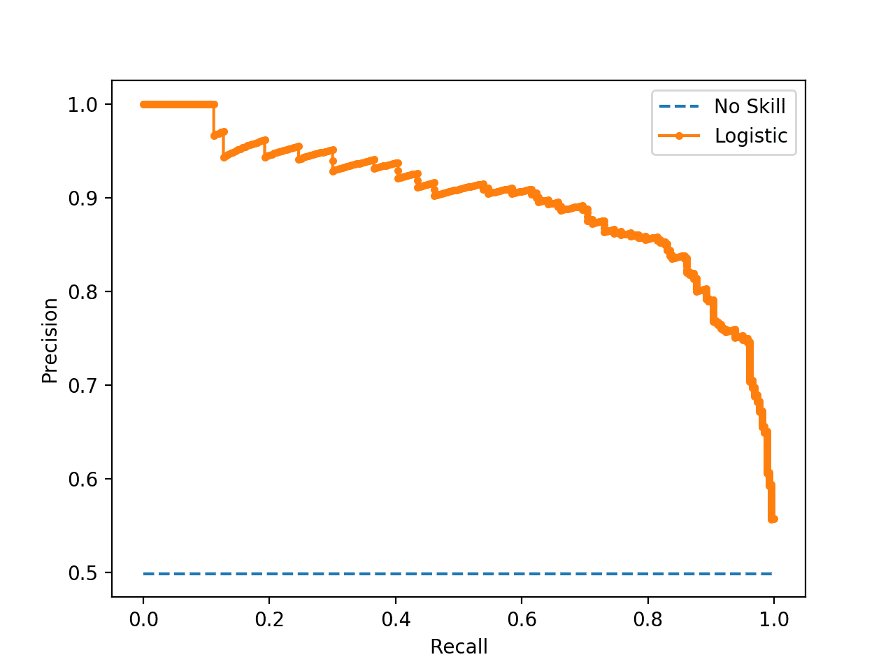
Precision-Recall Curve of a Logistic Regression Model and a No Skill Classifier
Now that we have seen the Precision-Recall Curve, let’s take a closer look at the ROC area under curve score.
Precision-Recall Area Under Curve (AUC) Score
The Precision-Recall AUC is just like the ROC AUC, in that it summarizes the curve with a range of threshold values as a single score.
The score can then be used as a point of comparison between different models on a binary classification problem where a score of 1.0 represents a model with perfect skill.
The Precision-Recall AUC score can be calculated using the auc() function in scikit-learn, taking the precision and recall values as arguments.
...
# calculate the precision-recall auc
auc_score = auc(recall, precision)
Again, we can demonstrate calculating the Precision-Recall AUC for a Logistic Regression on a synthetic dataset.
The complete example is listed below.
# example of a precision-recall auc for a predictive model
from sklearn.datasets import make_classification
from sklearn.dummy import DummyClassifier
from sklearn.linear_model import LogisticRegression
from sklearn.model_selection import train_test_split
from sklearn.metrics import precision_recall_curve
from sklearn.metrics import auc
# generate 2 class dataset
X, y = make_classification(n_samples=1000, n_classes=2, random_state=1)
# split into train/test sets
trainX, testX, trainy, testy = train_test_split(X, y, test_size=0.5, random_state=2)
# no skill model, stratified random class predictions
model = DummyClassifier(strategy='stratified')
model.fit(trainX, trainy)
yhat = model.predict_proba(testX)
pos_probs = yhat[:, 1]
# calculate the precision-recall auc
precision, recall, _ = precision_recall_curve(testy, pos_probs)
auc_score = auc(recall, precision)
print('No Skill PR AUC: %.3f' % auc_score)
# fit a model
model = LogisticRegression(solver='lbfgs')
model.fit(trainX, trainy)
yhat = model.predict_proba(testX)
pos_probs = yhat[:, 1]
# calculate the precision-recall auc
precision, recall, _ = precision_recall_curve(testy, pos_probs)
auc_score = auc(recall, precision)
print('Logistic PR AUC: %.3f' % auc_score)
Running the example creates and splits the synthetic dataset, fits the model, and uses the fit model to predict probabilities on the test dataset.
In this case, we can see that the Precision-Recall AUC for the Logistic Regression model on the synthetic dataset is about 0.898, which is much better than a no skill classifier that would achieve the score in this case of 0.632.
No Skill PR AUC: 0.632
Logistic PR AUC: 0.898
ROC and Precision-Recall Curves With a Severe Imbalance
In this section, we will explore the case of using the ROC Curves and Precision-Recall curves with a binary classification problem that has a severe class imbalance.
Firstly, we can use the make_classification() function to create 1,000 examples for a classification problem with about a 1:100 minority to majority class ratio. This can be achieved by setting the “weights” argument and specifying the weighting of generated instances from each class.
We will use a 99 percent and 1 percent weighting with 1,000 total examples, meaning there would be about 990 for class 0 and about 10 for class 1.
...
# generate 2 class dataset
X, y = make_classification(n_samples=1000, n_classes=2, weights=[0.99, 0.01], random_state=1)
We can then split the dataset into training and test sets and ensure that both have the same general class ratio by setting the “stratify” argument on the call to the train_test_split() function and setting it to the array of target variables.
...
# split into train/test sets with same class ratio
trainX, testX, trainy, testy = train_test_split(X, y, test_size=0.5, random_state=2, stratify=y)
Tying this together, the complete example of preparing the imbalanced dataset is listed below.
# create an imbalanced dataset
from sklearn.datasets import make_classification
from sklearn.model_selection import train_test_split
# generate 2 class dataset
X, y = make_classification(n_samples=1000, n_classes=2, weights=[0.99, 0.01], random_state=1)
# split into train/test sets with same class ratio
trainX, testX, trainy, testy = train_test_split(X, y, test_size=0.5, random_state=2, stratify=y)
# summarize dataset
print('Dataset: Class0=%d, Class1=%d' % (len(y[y==0]), len(y[y==1])))
print('Train: Class0=%d, Class1=%d' % (len(trainy[trainy==0]), len(trainy[trainy==1])))
print('Test: Class0=%d, Class1=%d' % (len(testy[testy==0]), len(testy[testy==1])))
Running the example first summarizes the class ratio of the whole dataset, then the ratio for each of the train and test sets, confirming the split of the dataset holds the same ratio.
Dataset: Class0=985, Class1=15
Train: Class0=492, Class1=8
Test: Class0=493, Class1=7
Next, we can develop a Logistic Regression model on the dataset and evaluate the performance of the model using a ROC Curve and ROC AUC score, and compare the results to a no skill classifier, as we did in a prior section.
The complete example is listed below.
# roc curve and roc auc on an imbalanced dataset
from sklearn.datasets import make_classification
from sklearn.linear_model import LogisticRegression
from sklearn.dummy import DummyClassifier
from sklearn.model_selection import train_test_split
from sklearn.metrics import roc_curve
from sklearn.metrics import roc_auc_score
from matplotlib import pyplot

# plot no skill and model roc curves
def plot_roc_curve(test_y, naive_probs, model_probs):
	# plot naive skill roc curve
	fpr, tpr, _ = roc_curve(test_y, naive_probs)
	pyplot.plot(fpr, tpr, linestyle='--', label='No Skill')
	# plot model roc curve
	fpr, tpr, _ = roc_curve(test_y, model_probs)
	pyplot.plot(fpr, tpr, marker='.', label='Logistic')
	# axis labels
	pyplot.xlabel('False Positive Rate')
	pyplot.ylabel('True Positive Rate')
	# show the legend
	pyplot.legend()
	# show the plot
	pyplot.show()

# generate 2 class dataset
X, y = make_classification(n_samples=1000, n_classes=2, weights=[0.99, 0.01], random_state=1)
# split into train/test sets with same class ratio
trainX, testX, trainy, testy = train_test_split(X, y, test_size=0.5, random_state=2, stratify=y)
# no skill model, stratified random class predictions
model = DummyClassifier(strategy='stratified')
model.fit(trainX, trainy)
yhat = model.predict_proba(testX)
naive_probs = yhat[:, 1]
# calculate roc auc
roc_auc = roc_auc_score(testy, naive_probs)
print('No Skill ROC AUC %.3f' % roc_auc)
# skilled model
model = LogisticRegression(solver='lbfgs')
model.fit(trainX, trainy)
yhat = model.predict_proba(testX)
model_probs = yhat[:, 1]
# calculate roc auc
roc_auc = roc_auc_score(testy, model_probs)
print('Logistic ROC AUC %.3f' % roc_auc)
# plot roc curves
plot_roc_curve(testy, naive_probs, model_probs)
Running the example creates the imbalanced binary classification dataset as before.
Then a logistic regression model is fit on the training dataset and evaluated on the test dataset. A no skill classifier is evaluated alongside for reference.
The ROC AUC scores for both classifiers are reported, showing the no skill classifier achieving the lowest score of approximately 0.5 as expected. The results for the logistic regression model suggest it has some skill with a score of about 0.869.
No Skill ROC AUC 0.490
Logistic ROC AUC 0.869
A ROC curve is also created for the model and the no skill classifier, showing not excellent performance, but definitely skillful performance as compared to the diagonal no skill.
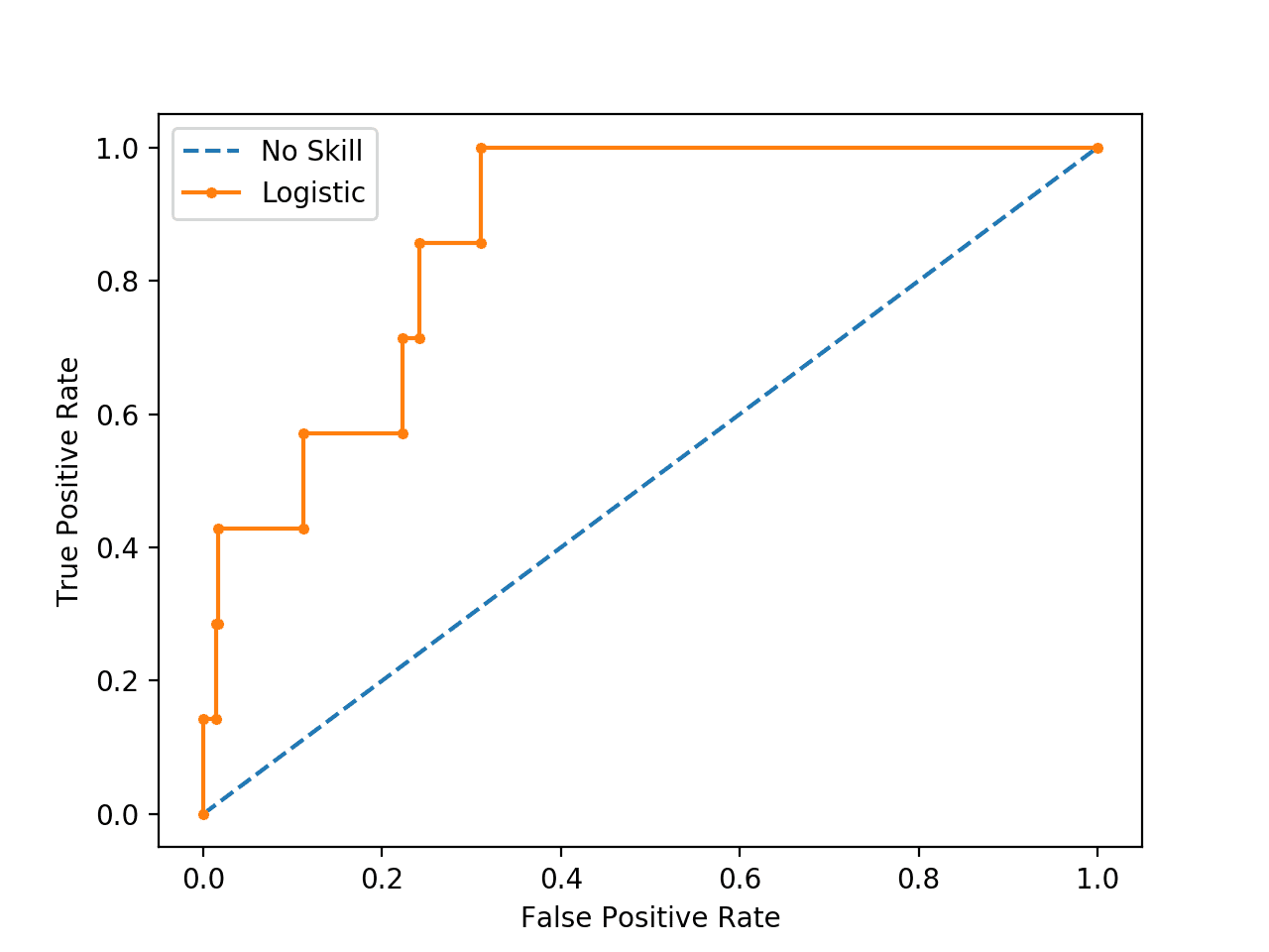
Plot of ROC Curve for Logistic Regression on Imbalanced Classification Dataset
Next, we can perform an analysis of the same model fit and evaluated on the same data using the precision-recall curve and AUC score.
The complete example is listed below.
# pr curve and pr auc on an imbalanced dataset
from sklearn.datasets import make_classification
from sklearn.dummy import DummyClassifier
from sklearn.linear_model import LogisticRegression
from sklearn.model_selection import train_test_split
from sklearn.metrics import precision_recall_curve
from sklearn.metrics import auc
from matplotlib import pyplot

# plot no skill and model precision-recall curves
def plot_pr_curve(test_y, model_probs):
	# calculate the no skill line as the proportion of the positive class
	no_skill = len(test_y[test_y==1]) / len(test_y)
	# plot the no skill precision-recall curve
	pyplot.plot([0, 1], [no_skill, no_skill], linestyle='--', label='No Skill')
	# plot model precision-recall curve
	precision, recall, _ = precision_recall_curve(testy, model_probs)
	pyplot.plot(recall, precision, marker='.', label='Logistic')
	# axis labels
	pyplot.xlabel('Recall')
	pyplot.ylabel('Precision')
	# show the legend
	pyplot.legend()
	# show the plot
	pyplot.show()

# generate 2 class dataset
X, y = make_classification(n_samples=1000, n_classes=2, weights=[0.99, 0.01], random_state=1)
# split into train/test sets with same class ratio
trainX, testX, trainy, testy = train_test_split(X, y, test_size=0.5, random_state=2, stratify=y)
# no skill model, stratified random class predictions
model = DummyClassifier(strategy='stratified')
model.fit(trainX, trainy)
yhat = model.predict_proba(testX)
naive_probs = yhat[:, 1]
# calculate the precision-recall auc
precision, recall, _ = precision_recall_curve(testy, naive_probs)
auc_score = auc(recall, precision)
print('No Skill PR AUC: %.3f' % auc_score)
# fit a model
model = LogisticRegression(solver='lbfgs')
model.fit(trainX, trainy)
yhat = model.predict_proba(testX)
model_probs = yhat[:, 1]
# calculate the precision-recall auc
precision, recall, _ = precision_recall_curve(testy, model_probs)
auc_score = auc(recall, precision)
print('Logistic PR AUC: %.3f' % auc_score)
# plot precision-recall curves
plot_pr_curve(testy, model_probs)
As before, running the example creates the imbalanced binary classification dataset.
In this case we can see that the Logistic Regression model achieves a PR AUC of about 0.228 and a no skill model achieves a PR AUC of about 0.007.
No Skill PR AUC: 0.007
Logistic PR AUC: 0.228
A plot of the precision-recall curve is also created.
We can see the horizontal line of the no skill classifier as expected and in this case the zig-zag line of the logistic regression curve close to the no skill line.
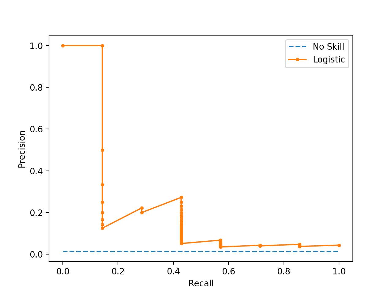
Plot of Precision-Recall Curve for Logistic Regression on Imbalanced Classification Dataset
To explain why the ROC and PR curves tell a different story, recall that the PR curve focuses on the minority class, whereas the ROC curve covers both classes.
If we use a threshold of 0.5 and use the logistic regression model to make a prediction for all examples in the test set, we see that it predicts class 0 or the majority class in all cases. This can be confirmed by using the fit model to predict crisp class labels, that will use the default threshold of 0.5. The distribution of predicted class labels can then be summarized.
...
# predict class labels
yhat = model.predict(testX)
# summarize the distribution of class labels
print(Counter(yhat))
We can then create a histogram of the predicted probabilities of the positive class to confirm that the mass of predicted probabilities is below 0.5, and therefore are mapped to class 0.
...
# create a histogram of the predicted probabilities
pyplot.hist(pos_probs, bins=100)
pyplot.show()
Tying this together, the complete example is listed below.
# summarize the distribution of predicted probabilities
from collections import Counter
from matplotlib import pyplot
from sklearn.datasets import make_classification
from sklearn.linear_model import LogisticRegression
from sklearn.model_selection import train_test_split
# generate 2 class dataset
X, y = make_classification(n_samples=1000, n_classes=2, weights=[0.99, 0.01], random_state=1)
# split into train/test sets with same class ratio
trainX, testX, trainy, testy = train_test_split(X, y, test_size=0.5, random_state=2, stratify=y)
# fit a model
model = LogisticRegression(solver='lbfgs')
model.fit(trainX, trainy)
# predict probabilities
yhat = model.predict_proba(testX)
# retrieve just the probabilities for the positive class
pos_probs = yhat[:, 1]
# predict class labels
yhat = model.predict(testX)
# summarize the distribution of class labels
print(Counter(yhat))
# create a histogram of the predicted probabilities
pyplot.hist(pos_probs, bins=100)
pyplot.show()
Running the example first summarizes the distribution of predicted class labels. As we expected, the majority class (class 0) is predicted for all examples in the test set.
Counter({0: 500})
A histogram plot of the predicted probabilities for class 1 is also created, showing the center of mass (most predicted probabilities) is less than 0.5 and in fact is generally close to zero.
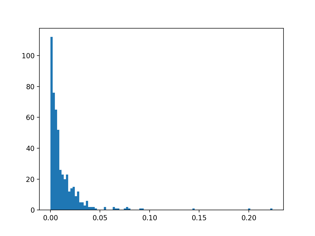
Histogram of Logistic Regression Predicted Probabilities for Class 1 for Imbalanced Classification
This means, unless probability threshold is carefully chosen, any skillful nuance in the predictions made by the model will be lost. Selecting thresholds used to interpret predicted probabilities as crisp class labels is an important topic
Further Reading
This section provides more resources on the topic if you are looking to go deeper.
Tutorials
Papers
Books
- Imbalanced Learning: Foundations, Algorithms, and Applications, 2013.
- Learning from Imbalanced Data Sets, 2018.
API
- sklearn.datasets.make_classification API.
- sklearn.metrics.roc_curve API.
- sklearn.metrics.roc_auc_score API
- precision_recall_curve API.
- sklearn.metrics.auc API.
Articles
Summary
In this tutorial, you discovered ROC Curves and Precision-Recall Curves for imbalanced classification.
Specifically, you learned:
- ROC Curves and Precision-Recall Curves provide a diagnostic tool for binary classification models.
- ROC AUC and Precision-Recall AUC provide scores that summarize the curves and can be used to compare classifiers.
- ROC Curves and ROC AUC can be optimistic on severely imbalanced classification problems with few samples of the minority class.
Do you have any questions?
Ask your questions in the comments below and I will do my best to answer.
The post ROC Curves and Precision-Recall Curves for Imbalanced Classification appeared first on Machine Learning Mastery.
