
Author: Kevin Mekulu
Summary
- Anyone can learn quantitative trading. You don’t need to have a PhD in Quantum Astrophysics to create quantitative trading systems or perform quantitative research
- The process of identifying a suitable trading strategy is identical to the scientific method: It requires creating hypotheses and making assumptions based on data to identify a statistical edge.
- Quantitative research (data mining, hypothesis testing…) always precedes backtesting trading strategies
As a trading enthusiast, I have always wondered if the best quant traders possessed predetermined trading strategies that they could use to consistently generate superior returns. I thought trading was as straightforward as solving an equation and using the solution to generate market beating returns. After doing some research and chatting with a few pro quant traders, I started familiarizing myself with quantitative analysis techniques to get a better understanding of the entire quantitative research process.
Let’s look at what the quantitative research process looks like.
We’ll be analyzing the stock of the most popular company in the world: Apple stock (ticker: $AAPL).
STEP 1: Analyze the distribution of daily returns
Note: We will be using the research environment provided by Quantconnect to perform our research.
We start off our analysis by plotting the distribution of AAPL returns over the past 5000 days.
# import all the modules we will be using in our analysis
import numpy as np

import seaborn as sns

import matplotlib.pyplot as plt

plt.style.use('ggplot')

plt.rcParams['figure.figsize'] = [11, 8]qb = QuantBook() # Open the QuantBook Analysis Tool from Quantconnect

spy = qb.AddEquity("AAPL") # Load AAPL historical data

history = qb.History(qb.Securities.Keys, 5000, Resolution.Daily) # 5000 daily datapoints# Drop pandas level

history = history.reset_index().drop('symbol',axis=1)# Calculate APPL returns and fillna

history['returns'] = (history['close'].pct_change() * 100).fillna(0)

sns.distplot(history['returns'],label='Distribution of AAPL returns')

plt.legend()

plt.show()
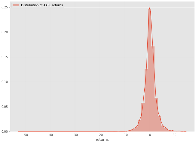
Figure 1–1: Histogram of the distribution of Apple’s daily returns
The next step would be to compare this distribution to a normal distribution. (A lot of models used in quantitative finance and statistics assume a normal or lognormal distribution)
STEP 2: Compare figure 1–1 to the normal distribution
Let’s generate some random data to plot the normal distribution.
random = np.random.normal(scale=1.23,size=500000)
sns.distplot(random,label='Returns sampled from normal distribution',color='blue')

plt.legend()

random_series = pd.Series(random)
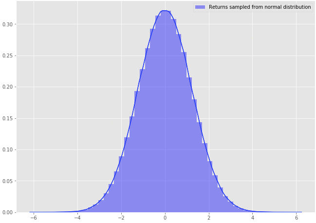
Figure 1–2: Histogram of the normal distribution (obtained by generating random data)
Now that we have plotted both distributions, let’s put them in one plot for comparison purposes.
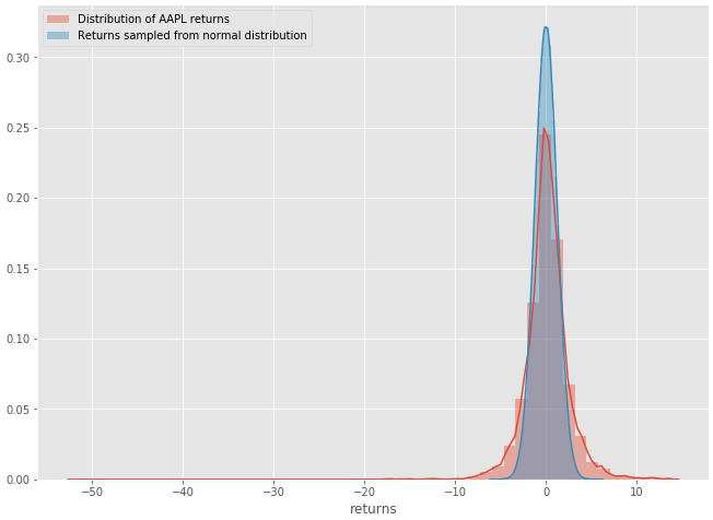
Figure 1–3: AAPL distribution returns vs Random normal distribution
Comparison Summary
- The distribution of Apple stock daily returns resemble the normal distribution
- The distribution of Apple stock has “heavier tails”. In layman terms, we can expect outsized moves to the upside and downsize, more so than a normal distribution would suggest.
- Statisticians often use the “kurtosis” of a distribution as a statistical measure to simply identify wether the tails of a given distribution contain extreme values.
STEP 3: Investigate patterns in our data (the fun part)
Jim Simons, arguably one of the most successful quant traders of all times once said: “We search through historical data looking for anomalous patterns that we would not expect to occur at random.”
Let’s follow Jim’s advice and explore Apple’s historical data to see if we can uncover some interesting patterns. Let’s look at the hourly resolution data (typically hard to find for free but easily accessible through the Quantconnect platform).
aapl_hour = qb.History(qb.Securities.Keys, timedelta(days=5000), Resolution.Hour) # 5000 days of AAPL hourly data
aapl_hour = aapl_hour.reset_index().drop('symbol',axis=1)

# Transform datetime into hours

aapl_hour['hour'] = aapl_hour['time'].apply(lambda x: x.hour)

# Calculate Hourly returns

aapl_hour['returns'] = (aapl_hour['close'].pct_change() * 100).fillna(0)

aapl_hour.head()
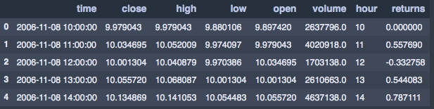
Figure 1–4: AAPL hourly returns
sns.barplot(x='hour',y='returns',data=aapl_hour)
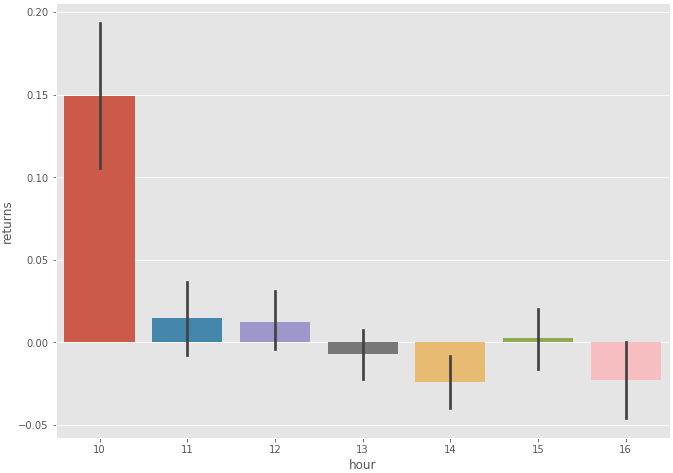
Figure 1–4: Boxplot of AAPL hourly returns
It looks like the most substantial returns were made overnight. An interesting idea would be to “buy at market close and sell at market open” to capture overnight gains. You can investigate this phenomenon further by exploring this research paper which explains “the overnight drift” (Most gains are made in the after hours).
Let’s continue to explore the discrepancy that we previously discovered. The previous bar plot suggested that there were substantial gains made in the after hours. Let’s plot the cumulative performance of overnight returns vs intraday returns to better visualize and confirm this discrepancy.
aapl_hour.query("hour == 10")['returns'].cumsum().plot(label='Overnight Returns')
aapl_hour.query("hour != 10")['returns'].cumsum().plot(label='Intraday Returns')

plt.legend()
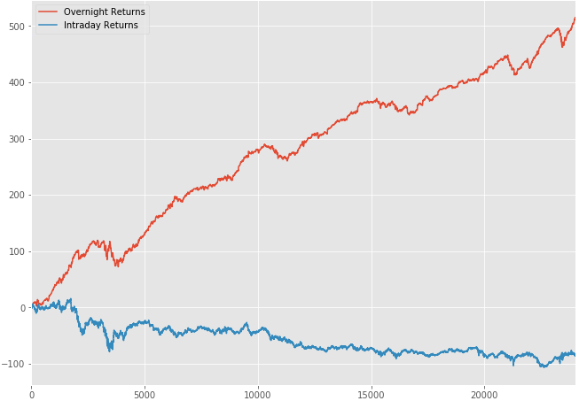
Figure 1–5: Overnight Returns vs Intraday Returns (Apple Stock)
Our hypothesis was correct. It’s quite apparent that most returns are realized in the after hours.
STEP 4: Look for potential autocorrelations/trends
Autocorrelation is a mathematical representation of the degree of similarity between a time series and a lagged version of itself over successive time intervals. in simpler terms, it describes how the present value of a series is related to its past values. You can learn more about autocorrelations here.
The goal of the quantitative analyst is to look for possible trends within the dataset. This can be accomplished by analyzing the Autocorrelation function plot (ACF plot).
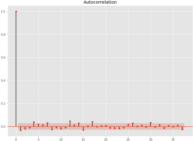
figure 1–6: ACF plot
It looks like there are no significantly correlated lags (we are basically looking for autocorrelations that lie outside the red band).
If the first lag on the graph lied outside for the red band for instance, then we would have concluded that there is a negative autocorrelation at lag 1 (on the x-axis of the ACF plot). Once you have that information, you could potentially investigate the relationship between that lag and the stock’s annual volatility.
history['rolling_lag_1'] = history['returns'].rolling(window=100).apply(lambda x:acf(x)[1],raw=True)history['annVol'] = history['returns'].rolling(window=100).std() * np.sqrt(252)
sns.regplot(x='annVol',y='rolling_lag_1',data=history)
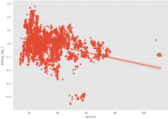
Fig 1–7: Rolling lag 1 vs Annual Volatility
There seems to be a negative correlation between the volatility of AAPL and its lag 1 autocorrelation. Furthermore, we can visualize how that relationship held up over the past 5 years.
sns.regplot(x='annVol',y='rolling_lag_1',data=history.loc['2015-01-01':'2021-01-01'],label='2015-Now')
plt.legend()
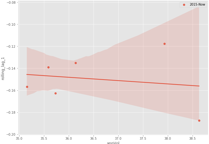
Figure 1–8: Annual volatility vs Rolling lag 1 (from 2015 to now)
As expected, there is no clear consistent relationship between volatility and the rolling lag 1 correlation of Apple stock returns. This is how you would typically investigate time series data.
Conclusion
- The noise to signal ratio is extremely high in quantitative analysis. Clean and consistent patterns are usually very subtle and can quickly vanish
- Based on our research, a substantial amount of Apple stock returns is made in the after-hours
Originally posted here