Author: Jason Brownlee
Sometimes data does not make sense until you can look at in a visual form, such as with charts and plots.
Being able to quickly visualize your data samples for yourself and others is an important skill both in applied statistics and in applied machine learning.
In this tutorial, you will discover the five types of plots that you will need to know when visualizing data in Python and how to use them to better understand your own data.
After completing this tutorial, you will know:
- How to chart time series data with line plots and categorical quantities with bar charts.
- How to summarize data distributions with histograms and box plots.
- How to summarize the relationship between variables with scatter plots.
Let’s get started.

A Gentle Introduction to Data Visualization Methods in Python
Photo by Ian Sutton, some rights reserved.
Tutorial Overview
This tutorial is divided into 7 parts; they are:
- Data Visualization
- Introduction to Matplotlib
- Line Plot
- Bar Chart
- Histogram Plot
- Box and Whisker Plot
- Scatter Plot
Need help with Statistics for Machine Learning?
Take my free 7-day email crash course now (with sample code).
Click to sign-up and also get a free PDF Ebook version of the course.
Data Visualization
Data visualization is an important skill in applied statistics and machine learning.
Statistics does indeed focus on quantitative descriptions and estimations of data. Data visualization provides an important suite of tools for gaining a qualitative understanding.
This can be helpful when exploring and getting to know a dataset and can help with identifying patterns, corrupt data, outliers, and much more. With a little domain knowledge, data visualizations can be used to express and demonstrate key relationships in plots and charts that are more visceral to yourself and stakeholders than measures of association or significance.
Data visualization and exploratory data analysis are whole fields themselves and I will recommend a deeper dive into some the books mentioned at the end. In this tutorial, let’s look at basic charts and plots you can use to better understand your data.
There are five key plots that you need to know well for basic data visualization. They are:
- Line Plot
- Bar Chart
- Histogram Plot
- Box and Whisker Plot
- Scatter Plot
With a knowledge of these plots, you can quickly get a qualitative understanding of most data that you come across.
For the rest of this tutorial, we will take a closer look at each plot type.
Introduction to Matplotlib
There are many excellent plotting libraries in Python and I recommend exploring them in order to create presentable graphics.
For quick and dirty plots intended for your own use, I recommend using the matplotlib library. It is the foundation for many other plotting libraries and plotting support in higher-level libraries such as Pandas.
The matplotlib provides a context, one in which one or more plots can be drawn before the image is shown or saved to file. The context can be accessed via functions on pyplot. The context can be imported as follows:
import matplotlib import pyplot
There is some convention to import this context and name it plt; for example:
import matplotlib.pyplot as plt
We will not use this convention, instead we will stick to the standard Python import convention.
Charts and plots are made by making and calling on context; for example:
pyplot.plot(...)
Elements such as axis, labels, legends, and so on can be accessed and configured on this context as separate function calls.
The drawings on the context can be shown in a new window by calling the show() function:
# display the plot
pyplot.show()
Alternately, the drawings on the context can be saved to file, such as a PNG formatted image file. The savefig() function can be used to save images.
pyplot.savefig('my_image.png')
This is the most basic crash course for using the matplotlib library.
For more detail, see the User Guide and the resources at the end of the tutorial.
Line Plot
A line plot is generally used to present observations collected at regular intervals.
The x-axis represents the regular interval, such as time. The y-axis shows the observations, ordered by the x-axis and connected by a line.
A line plot can be created by calling the plot() function and passing the x-axis data for the regular interval, and y-axis for the observations.
# create line plot
pyplot.plot(x, y)
Line plots are useful for presenting time series data as well as any sequence data where there is an ordering between observations.
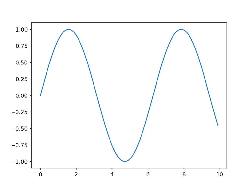
The example below creates a sequence of 100 floating point values as the x-axis and a sine wave as a function of the x-axis as the observations on the y-axis. The results are plotted as a line plot.
# example of a line plot
from numpy import sin
from matplotlib import pyplot
# consistent interval for x-axis
x = [x*0.1 for x in range(100)]
# function of x for y-axis
y = sin(x)
# create line plot
pyplot.plot(x, y)
# show line plot
pyplot.show()
Running the example creates a line plot showing the familiar sine wave pattern on the y-axis across the x-axis with a consistent interval between observations.

Example of a Line Plot
Bar Chart
A bar chart is generally used to present relative quantities for multiple categories.
The x-axis represents the categories and are spaced evenly. The y-axis represents the quantity for each category and is drawn as a bar from the baseline to the appropriate level on the y-axis.
A bar chart can be created by calling the bar() function and passing the category names for the x-axis and the quantities for the y-axis.
# create bar chart
pyplot.bar(x, y)
Bar charts can be useful for comparing multiple point quantities or estimations.
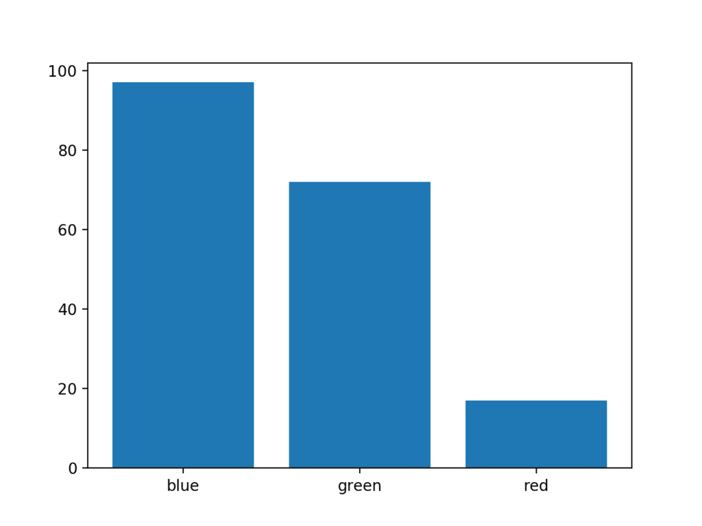
The example below creates a dataset with three categories, each defined with a string label. A single random integer value is drawn for the quantity in each category.
# example of a bar chart
from random import seed
from random import randint
from matplotlib import pyplot
# seed the random number generator
seed(1)
# names for categories
x = ['red', 'green', 'blue']
# quantities for each category
y = [randint(0, 100), randint(0, 100), randint(0, 100)]
# create bar chart
pyplot.bar(x, y)
# show line plot
pyplot.show()
Running the example creates the bar chart showing the category labels on the x-axis and the quantities on the y-axis.

Example of a Bar Chart
Histogram Plot
A histogram plot is generally used to summarize the distribution of a data sample.
The x-axis represents discrete bins or intervals for the observations. For example observations with values between 1 and 10 may be split into five bins, the values [1,2] would be allocated to the first bin, [3,4] would be allocated to the second bin, and so on.
The y-axis represents the frequency or count of the number of observations in the dataset that belong to each bin.
Essentially, a data sample is transformed into a bar chart where each category on the x-axis represents an interval of observation values.
Histograms are density estimates. A density estimate gives a good impression of the distribution of the data.[…] The idea is to locally represent the data density by counting the number of observations in a sequence of consecutive intervals (bins) …
— Page 11, Applied Multivariate Statistical Analysis, 2015.
A histogram plot can be created by calling the hist() function and passing in a list or array that represents the data sample.
# create histogram plot
pyplot.hist(x)
Histograms are valuable for summarizing the distribution of data samples.
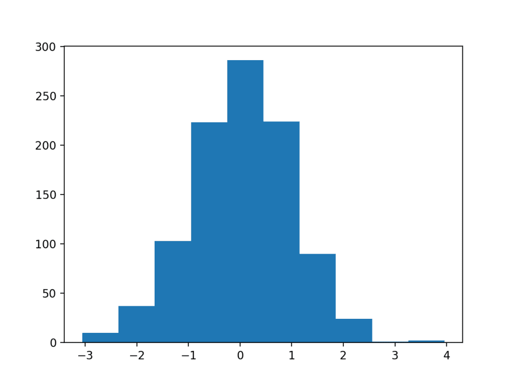
The example below creates a dataset of 1,000 random numbers drawn from a standard Gaussian distribution, then plots the dataset as a histogram.
# example of a histogram plot
from numpy.random import seed
from numpy.random import randn
from matplotlib import pyplot
# seed the random number generator
seed(1)
# random numbers drawn from a Gaussian distribution
x = randn(1000)
# create histogram plot
pyplot.hist(x)
# show line plot
pyplot.show()
Running the example, we can see that the shape of the bars shows the bell-shaped curve of the Gaussian distribution. We can see that the function automatically chose the number of bins, in this case splitting the values into groups by integer value.

Example of a Histogram Plot
Often, careful choice of the number of bins can help to better expose the shape of the data distribution. The number of bins can be specified by setting the “bins” argument; for example:
# create histogram plot
pyplot.hist(x, bins=100)
Box and Whisker Plot
A box and whisker plot, or boxplot for short, is generally used to summarize the distribution of a data sample.
The x-axis is used to represent the data sample, where multiple boxplots can be drawn side by side on the x-axis if desired.
The y-axis represents the observation values. A box is drawn to summarize the middle 50% of the dataset starting at the observation at the 25th percentile and ending at the 75th percentile. The median, or 50th percentile, is drawn with a line. A value called the interquartile range, or IQR, is calculated as 1.5 * the difference between the 75th and 25th percentiles. Lines called whiskers are drawn extending from both ends of the box with the length of the IQR to demonstrate the expected range of sensible values in the distribution. Observations outside the whiskers might be outliers and are drawn with small circles.
The boxplot is a graphical technique that displays the distribution of variables. It helps us see the location, skewness, spread, tile length and outlying points. […] The boxplot is a graphical representation of the Five Number Summary.
— Page 5, Applied Multivariate Statistical Analysis, 2015.
Boxplots can be drawn by calling the boxplot() function passing in the data sample as an array or list.
# create box and whisker plot
pyplot.boxplot(x)
Boxplots are useful to summarize the distribution of a data sample as an alternative to the histogram. They can help to quickly get an idea of the range of common and sensible values in the box and in the whisker respectively. Because we are not looking at the shape of the distribution explicitly, this method is often used when the data has an unknown or unusual distribution, such as non-Gaussian.
The example below creates three boxplots in one chart, each summarizing a data sample drawn from a slightly different Gaussian distribution. Each data sample is created as an array and all three data sample arrays are added to a list that is padded to the plotting function.
# example of a box and whisker plot
from numpy.random import seed
from numpy.random import randn
from matplotlib import pyplot
# seed the random number generator
seed(1)
# random numbers drawn from a Gaussian distribution
x = [randn(1000), 5 * randn(1000), 10 * randn(1000)]
# create box and whisker plot
pyplot.boxplot(x)
# show line plot
pyplot.show()
Running the example creates a chart showing the three box and whisker plots. We can see that the same scale is used on the y-axis for each, making the first plot look squashed and the last plot look spread out.
In this case, we can see the black box for the middle 50% of the data, the orange line for the median, the lines for the whiskers summarizing the range of sensible data, and finally dots for the possible outliers.

Example of a Box and Whisker Plot
Scatter Plot
A scatter plot (or ‘scatterplot’) is generally used to summarize the relationship between two paired data samples.
Paired data samples means that two measures were recorded for a given observation, such as the weight and height of a person.
The x-axis represents observation values for the first sample, and the y-axis represents the observation values for the second sample. Each point on the plot represents a single observation.
Scatterplots are bivariate or trivariate plots of variables against each other. They help us understand relationships among the variables of a dataset. A downward-sloping scatter indicates that as we increase the variable on the horizontal axis, the variable on the vertical axis decreases.
— Page 19, Applied Multivariate Statistical Analysis, 2015.
Scatter plots can be created by calling the scatter() function and passing the two data sample arrays.
# create scatter plot
pyplot.scatter(x, y)
Scatter plots are useful for showing the association or correlation between two variables. A correlation can be quantified, such as a line of best fit, that too can be drawn as a line plot on the same chart, making the relationship clearer.
A dataset may have more than two measures (variables or columns) for a given observation. A scatter plot matrix is a cart containing scatter plots for each pair of variables in a dataset with more than two variables.
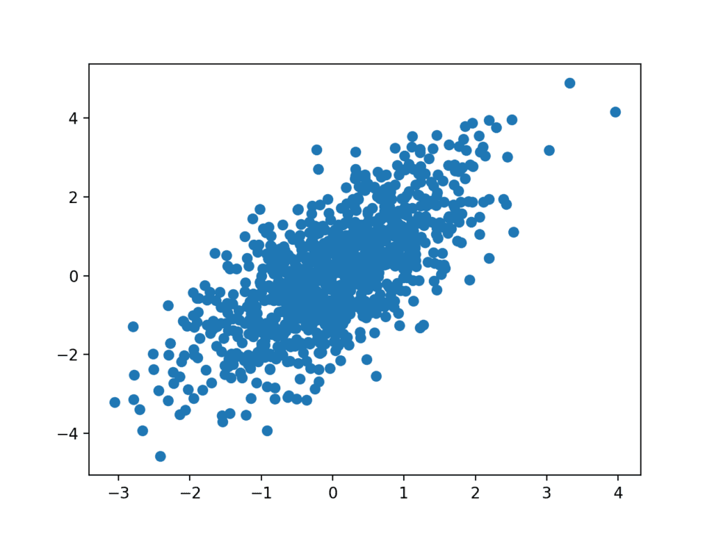
The example below creates two data samples that are related. The first is a sample of random numbers drawn from a standard Gaussian. The second is dependent upon the first by adding a second random Gaussian value to the value of the first measure.
# example of a scatter plot
from numpy.random import seed
from numpy.random import randn
from matplotlib import pyplot
# seed the random number generator
seed(1)
# first variable
x = 20 * randn(1000) + 100
# second variable
y = x + (10 * randn(1000) + 50)
# create scatter plot
pyplot.scatter(x, y)
# show line plot
pyplot.show()
Running the example creates the scatter plot, showing the positive relationship between the two variables.

Example of a Scatter Plot
Extensions
This section lists some ideas for extending the tutorial that you may wish to explore.
- Select one example and update it to use your own contrived dataset.
- Load a standard machine learning dataset and plot the variables.
- Write convenience functions to easily create plots for your data, including labels and legends.
If you explore any of these extensions, I’d love to know.
Further Reading
This section provides more resources on the topic if you are looking to go deeper.
Posts
- Visualize Machine Learning Data in Python With Pandas
- Time Series Data Visualization with Python
- Data Visualization with the Caret R package
Books
- The Visual Display of Quantitative Information, 2001.
- Python for Data Analysis: Data Wrangling with Pandas, NumPy, and IPython, 2017.
- Applied Multivariate Statistical Analysis, 2015.
API
- matplotlib library
- matplotlib User Guide
- matplotlib.pyplot() API
- matplotlib.pyplot.show() API
- matplotlib.pyplot.savefig() API
- matplotlib.pyplot.plot() API
- matplotlib.pyplot.bar() API
- matplotlib.pyplot.hist() API
- matplotlib.pyplot.boxplot() API
- matplotlib.pyplot.scatter() API
Articles
- Data visualization on Wikipedia
- Bar chart on Wikipedia
- Histogram on Wikipedia
- Box plot on Wikipedia
- Interquartile range on Wikipedia
- Scatter plot on Wikipedia
Summary
In this tutorial, you discovered a gentle introduction to visualization data in Python.
Specifically, you learned:
- How to chart time series data with line plots and categorical quantities with bar charts.
- How to summarize data distributions with histograms and boxplots.
- How to summarize the relationship between variables with scatter plots.
Do you have any questions?
Ask your questions in the comments below and I will do my best to answer.
The post A Gentle Introduction to Data Visualization Methods in Python appeared first on Machine Learning Mastery.
