Author: Jason Brownlee
Function optimization involves finding the input that results in the optimal value from an objective function.
Optimization algorithms navigate the search space of input variables in order to locate the optima, and both the shape of the objective function and behavior of the algorithm in the search space are opaque on real-world problems.
As such, it is common to study optimization algorithms using simple low-dimensional functions that can be easily visualized directly. Additionally, the samples in the input space of these simple functions made by an optimization algorithm can be visualized with their appropriate context.
Visualization of lower-dimensional functions and algorithm behavior on those functions can help to develop the intuitions that can carry over to more complex higher-dimensional function optimization problems later.
In this tutorial, you will discover how to create visualizations for function optimization in Python.
After completing this tutorial, you will know:
- Visualization is an important tool when studying function optimization algorithms.
- How to visualize one-dimensional functions and samples using line plots.
- How to visualize two-dimensional functions and samples using contour and surface plots.
Let’s get started.

Visualization for Function Optimization in Python
Photo by Nathalie, some rights reserved.
Tutorial Overview
This tutorial is divided into three parts; they are:
- Visualization for Function Optimization
- Visualize 1D Function Optimization
- Test Function
- Sample Test Function
- Line Plot of Test Function
- Scatter Plot of Test Function
- Line Plot with Marked Optima
- Line Plot with Samples
- Visualize 2D Function Optimization
- Test Function
- Sample Test Function
- Contour Plot of Test Function
- Filled Contour Plot of Test Function
- Filled Contour Plot of Test Function with Samples
- Surface Plot of Test Function
Visualization for Function Optimization
Function optimization is a field of mathematics concerned with finding the inputs to a function that result in the optimal output for the function, typically a minimum or maximum value.
Optimization may be straightforward for simple differential functions where the solution can be calculated analytically. However, most functions we’re interested in solving in applied machine learning may or may not be well behaved and may be complex, nonlinear, multivariate, and non-differentiable.
As such, it is important to have an understanding of a wide range of different algorithms that can be used to address function optimization problems.
An important aspect of studying function optimization is understanding the objective function that is being optimized and understanding the behavior of an optimization algorithm over time.
Visualization plays an important role when getting started with function optimization.
We can select simple and well-understood test functions to study optimization algorithms. These simple functions can be plotted to understand the relationship between the input to the objective function and the output of the objective function and highlighting hills, valleys, and optima.
In addition, the samples selected from the search space by an optimization algorithm can also be plotted on top of plots of the objective function. These plots of algorithm behavior can provide insight and intuition into how specific optimization algorithms work and navigate a search space that can generalize to new problems in the future.
Typically, one-dimensional or two-dimensional functions are chosen to study optimization algorithms as they are easy to visualize using standard plots, like line plots and surface plots. We will explore both in this tutorial.
First, let’s explore how we might visualize a one-dimensional function optimization.
Visualize 1D Function Optimization
A one-dimensional function takes a single input variable and outputs the evaluation of that input variable.
Input variables are typically continuous, represented by a real-valued floating-point value. Often, the input domain is unconstrained, although for test problems we impose a domain of interest.
Test Function
In this case we will explore function visualization with a simple x^2 objective function:
- f(x) = x^2
This has an optimal value with an input of x=0.0, which equals 0.0.
The example below implements this objective function and evaluates a single input.
# example of a 1d objective function

# objective function
def objective(x):
	return x**2.0

# evaluate inputs to the objective function
x = 4.0
result = objective(x)
print('f(%.3f) = %.3f' % (x, result))
Running the example evaluates the value 4.0 with the objective function, which equals 16.0.
f(4.000) = 16.000
Sample the Test Function
The first thing we might want to do with a new function is define an input range of interest and sample the domain of interest using a uniform grid.
This sample will provide the basis for generating a plot later.
In this case, we will define a domain of interest around the optima of x=0.0 from x=-5.0 to x=5.0 and sample a grid of values in this range with 0.1 increments, such as -5.0, -4.9, -4.8, etc.
...
# define range for input
r_min, r_max = -5.0, 5.0
# sample input range uniformly at 0.1 increments
inputs = arange(r_min, r_max, 0.1)
# summarize some of the input domain
print(inputs[:5])
We can then evaluate each of the x values in our sample.
...
# compute targets
results = objective(inputs)
# summarize some of the results
print(results[:5])
Finally, we can check some of the input and their corresponding outputs.
...
# create a mapping of some inputs to some results
for i in range(5):
	print('f(%.3f) = %.3f' % (inputs[i], results[i]))
Tying this together, the complete example of sampling the input space and evaluating all points in the sample is listed below.
# sample 1d objective function
from numpy import arange

# objective function
def objective(x):
	return x**2.0

# define range for input
r_min, r_max = -5.0, 5.0
# sample input range uniformly at 0.1 increments
inputs = arange(r_min, r_max, 0.1)
# summarize some of the input domain
print(inputs[:5])
# compute targets
results = objective(inputs)
# summarize some of the results
print(results[:5])
# create a mapping of some inputs to some results
for i in range(5):
	print('f(%.3f) = %.3f' % (inputs[i], results[i]))
Running the example first generates a uniform sample of input points as we expected.
The input points are then evaluated using the objective function and finally, we can see a simple mapping of inputs to outputs of the objective function.
[-5.  -4.9 -4.8 -4.7 -4.6]
[25.   24.01 23.04 22.09 21.16]
f(-5.000) = 25.000
f(-4.900) = 24.010
f(-4.800) = 23.040
f(-4.700) = 22.090
f(-4.600) = 21.160
Now that we have some confidence in generating a sample of inputs and evaluating them with the objective function, we can look at generating plots of the function.
Line Plot of Test Function
We could sample the input space randomly, but the benefit of a uniform line or grid of points is that it can be used to generate a smooth plot.
It is smooth because the points in the input space are ordered from smallest to largest. This ordering is important as we expect (hope) that the output of the objective function has a similar smooth relationship between values, e.g. small changes in input result in locally consistent (smooth) changes in the output of the function.
In this case, we can use the samples to generate a line plot of the objective function with the input points (x) on the x-axis of the plot and the objective function output (results) on the y-axis of the plot.
...
# create a line plot of input vs result
pyplot.plot(inputs, results)
# show the plot
pyplot.show()
Tying this together, the complete example is listed below.
# line plot of input vs result for a 1d objective function
from numpy import arange
from matplotlib import pyplot

# objective function
def objective(x):
	return x**2.0

# define range for input
r_min, r_max = -5.0, 5.0
# sample input range uniformly at 0.1 increments
inputs = arange(r_min, r_max, 0.1)
# compute targets
results = objective(inputs)
# create a line plot of input vs result
pyplot.plot(inputs, results)
# show the plot
pyplot.show()
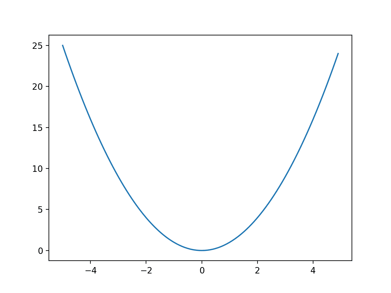
Running the example creates a line plot of the objective function.
We can see that the function has a large U-shape, called a parabola. This is a common shape when studying curves, e.g. the study of calculus.
Line Plot of a One-Dimensional Function
Scatter Plot of Test Function
The line is a construct. It is not really the function, just a smooth summary of the function. Always keep this in mind.
Recall that we, in fact, generated a sample of points in the input space and corresponding evaluation of those points.
As such, it would be more accurate to create a scatter plot of points; for example:
# scatter plot of input vs result for a 1d objective function
from numpy import arange
from matplotlib import pyplot

# objective function
def objective(x):
	return x**2.0

# define range for input
r_min, r_max = -5.0, 5.0
# sample input range uniformly at 0.1 increments
inputs = arange(r_min, r_max, 0.1)
# compute targets
results = objective(inputs)
# create a scatter plot of input vs result
pyplot.scatter(inputs, results)
# show the plot
pyplot.show()
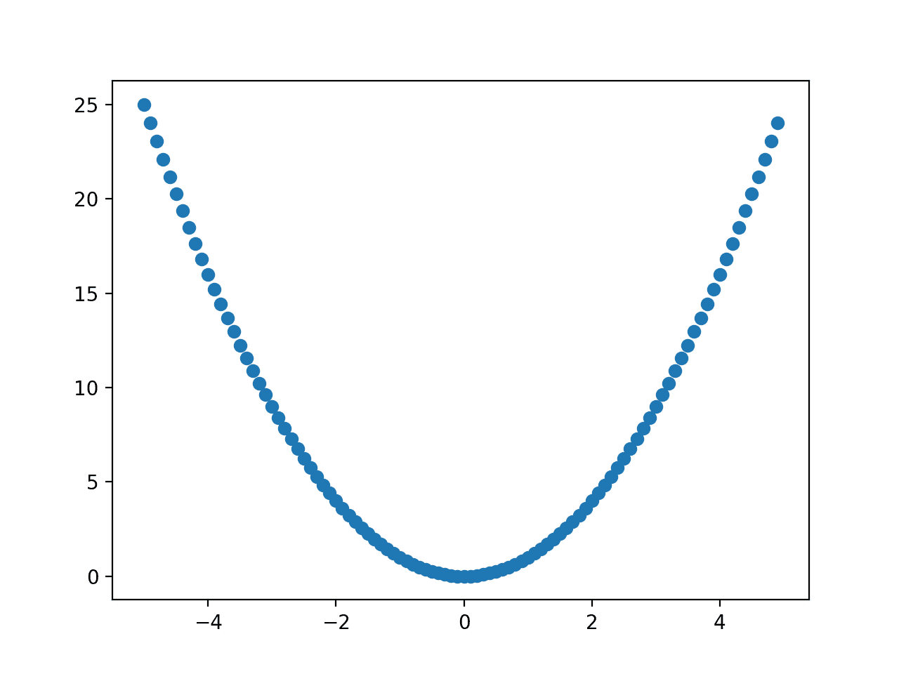
Running the example creates a scatter plot of the objective function.
We can see the familiar shape of the function, but we don’t gain anything from plotting the points directly.
The line and the smooth interpolation between the points it provides are more useful as we can draw other points on top of the line, such as the location of the optima or the points sampled by an optimization algorithm.
Scatter Plot of a One-Dimensional Function
Line Plot with Marked Optima
Next, let’s draw the line plot again and this time draw a point where the known optima of the function is located.
This can be helpful when studying an optimization algorithm as we might want to see how close an optimization algorithm can get to the optima.
First, we must define the input for the optima, then evaluate that point to give the x-axis and y-axis values for plotting.
...
# define the known function optima
optima_x = 0.0
optima_y = objective(optima_x)
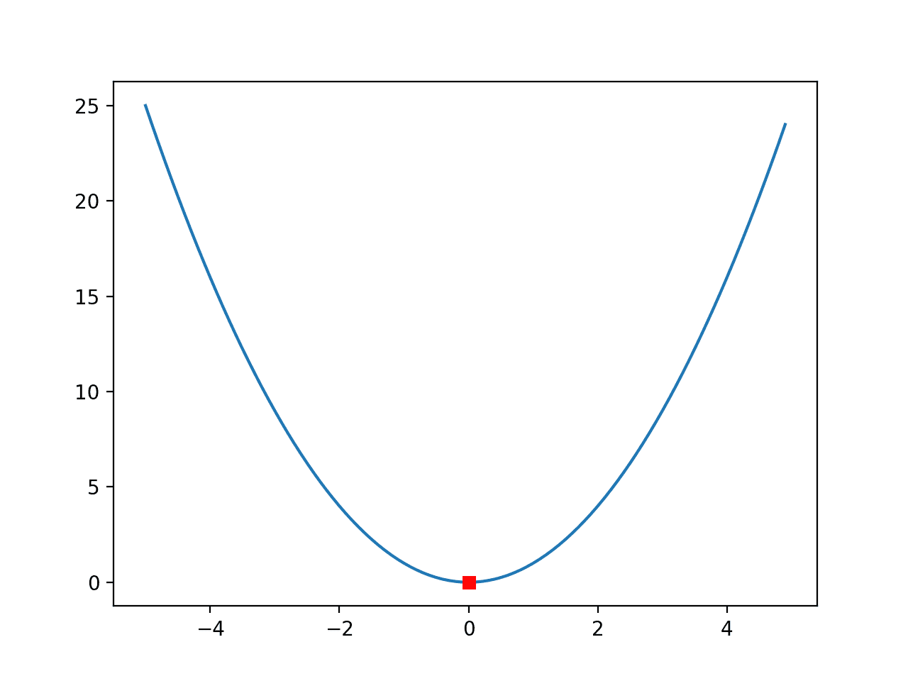
We can then plot this point with any shape or color we like, in this case, a red square.
...
# draw the function optima as a red square
pyplot.plot([optima_x], [optima_y], 's', color='r')
Tying this together, the complete example of creating a line plot of the function with the optima highlighted by a point is listed below.
# line plot of input vs result for a 1d objective function and show optima
from numpy import arange
from matplotlib import pyplot

# objective function
def objective(x):
	return x**2.0

# define range for input
r_min, r_max = -5.0, 5.0
# sample input range uniformly at 0.1 increments
inputs = arange(r_min, r_max, 0.1)
# compute targets
results = objective(inputs)
# create a line plot of input vs result
pyplot.plot(inputs, results)
# define the known function optima
optima_x = 0.0
optima_y = objective(optima_x)
# draw the function optima as a red square
pyplot.plot([optima_x], [optima_y], 's', color='r')
# show the plot
pyplot.show()
Running the example creates the familiar line plot of the function, and this time, the optima of the function, e.g. the input that results in the minimum output of the function, is marked with a red square.
Line Plot of a One-Dimensional Function With Optima Marked by a Red Square
This is a very simple function and the red square for the optima is easy to see.
Sometimes the function might be more complex, with lots of hills and valleys, and we might want to make the optima more visible.
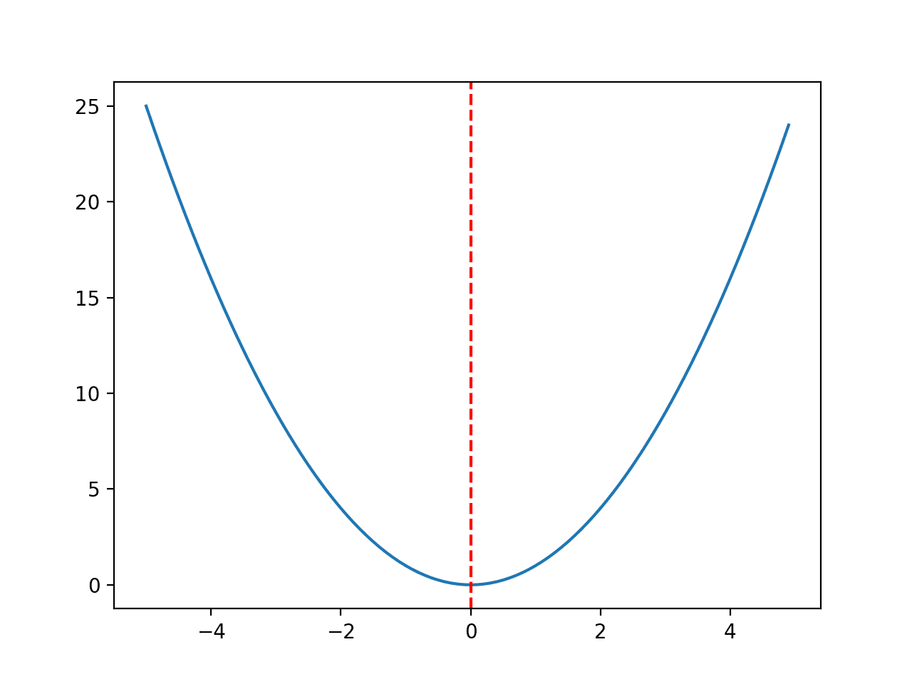
In this case, we can draw a vertical line across the whole plot.
...
# draw a vertical line at the optimal input
pyplot.axvline(x=optima_x, ls='--', color='red')
Tying this together, the complete example is listed below.
# line plot of input vs result for a 1d objective function and show optima as line
from numpy import arange
from matplotlib import pyplot

# objective function
def objective(x):
	return x**2.0

# define range for input
r_min, r_max = -5.0, 5.0
# sample input range uniformly at 0.1 increments
inputs = arange(r_min, r_max, 0.1)
# compute targets
results = objective(inputs)
# create a line plot of input vs result
pyplot.plot(inputs, results)
# define the known function optima
optima_x = 0.0
# draw a vertical line at the optimal input
pyplot.axvline(x=optima_x, ls='--', color='red')
# show the plot
pyplot.show()
Running the example creates the same plot and this time draws a red line clearly marking the point in the input space that marks the optima.
Line Plot of a One-Dimensional Function With Optima Marked by a Red Line
Line Plot with Samples
Finally, we might want to draw the samples of the input space selected by an optimization algorithm.
We will simulate these samples with random points drawn from the input domain.
...
# simulate a sample made by an optimization algorithm
seed(1)
sample = r_min + rand(10) * (r_max - r_min)
# evaluate the sample
sample_eval = objective(sample)
We can then plot this sample, in this case using small black circles.
...
# plot the sample as black circles
pyplot.plot(sample, sample_eval, 'o', color='black')
The complete example of creating a line plot of a function with the optima marked by a red line and an algorithm sample drawn with small black dots is listed below.
# line plot of domain for a 1d function with optima and algorithm sample
from numpy import arange
from numpy.random import seed
from numpy.random import rand
from matplotlib import pyplot

# objective function
def objective(x):
	return x**2.0

# define range for input
r_min, r_max = -5.0, 5.0
# sample input range uniformly at 0.1 increments
inputs = arange(r_min, r_max, 0.1)
# compute targets
results = objective(inputs)
# simulate a sample made by an optimization algorithm
seed(1)
sample = r_min + rand(10) * (r_max - r_min)
# evaluate the sample
sample_eval = objective(sample)
# create a line plot of input vs result
pyplot.plot(inputs, results)
# define the known function optima
optima_x = 0.0
# draw a vertical line at the optimal input
pyplot.axvline(x=optima_x, ls='--', color='red')
# plot the sample as black circles
pyplot.plot(sample, sample_eval, 'o', color='black')
# show the plot
pyplot.show()
Running the example creates the line plot of the domain and marks the optima with a red line as before.
This time, the sample from the domain selected by an algorithm (really a random sample of points) is drawn with black dots.
We can imagine that a real optimization algorithm will show points narrowing in on the domain as it searches down-hill from a starting point.
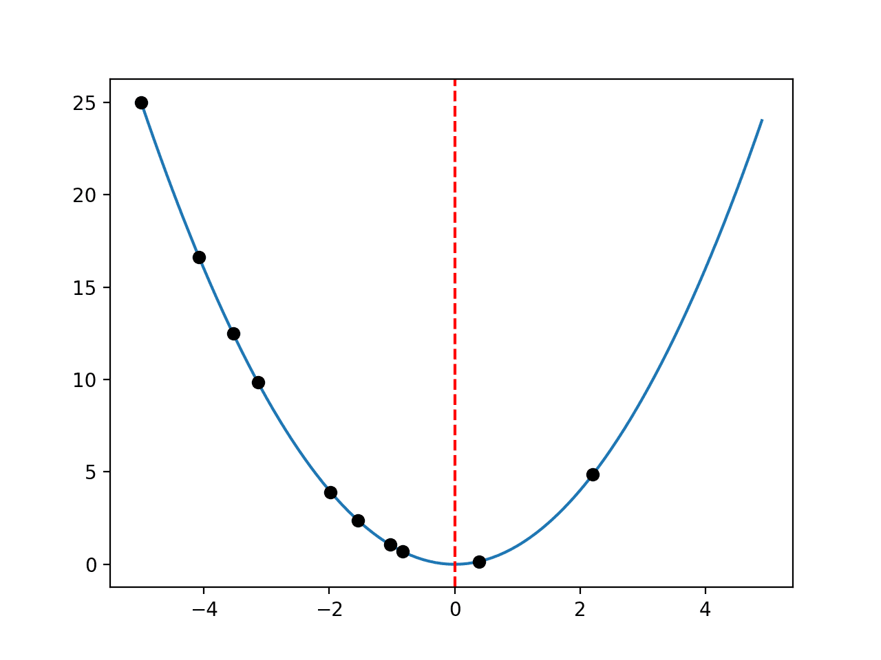
Line Plot of a One-Dimensional Function With Optima Marked by a Red Line and Samples Shown with Black Dots
Next, let’s look at how we might perform similar visualizations for the optimization of a two-dimensional function.
Visualize 2D Function Optimization
A two-dimensional function is a function that takes two input variables, e.g. x and y.
Test Function
We can use the same x^2 function and scale it up to be a two-dimensional function; for example:
- f(x, y) = x^2 + y^2
This has an optimal value with an input of [x=0.0, y=0.0], which equals 0.0.
The example below implements this objective function and evaluates a single input.
# example of a 2d objective function

# objective function
def objective(x, y):
	return x**2.0 + y**2.0

# evaluate inputs to the objective function
x = 4.0
y = 4.0
result = objective(x, y)
print('f(%.3f, %.3f) = %.3f' % (x, y, result))
Running the example evaluates the point [x=4, y=4], which equals 32.
f(4.000, 4.000) = 32.000
Next, we need a way to sample the domain so that we can, in turn, sample the objective function.
Sample Test Function
A common way for sampling a two-dimensional function is to first generate a uniform sample along each variable, x and y, then use these two uniform samples to create a grid of samples, called a mesh grid.
This is not a two-dimensional array across the input space; instead, it is two two-dimensional arrays that, when used together, define a grid across the two input variables.
This is achieved by duplicating the entire x sample array for each y sample point and similarly duplicating the entire y sample array for each x sample point.
This can be achieved using the meshgrid() NumPy function; for example:
...
# define range for input
r_min, r_max = -5.0, 5.0
# sample input range uniformly at 0.1 increments
xaxis = arange(r_min, r_max, 0.1)
yaxis = arange(r_min, r_max, 0.1)
# create a mesh from the axis
x, y = meshgrid(xaxis, yaxis)
# summarize some of the input domain
print(x[:5, :5])
We can then evaluate each pair of points using our objective function.
...
# compute targets
results = objective(x, y)
# summarize some of the results
print(results[:5, :5])
Finally, we can review the mapping of some of the inputs to their corresponding output values.
...
# create a mapping of some inputs to some results
for i in range(5):
	print('f(%.3f, %.3f) = %.3f' % (x[i,0], y[i,0], results[i,0]))
The example below demonstrates how we can create a uniform sample grid across the two-dimensional input space and objective function.
# sample 2d objective function
from numpy import arange
from numpy import meshgrid

# objective function
def objective(x, y):
	return x**2.0 + y**2.0

# define range for input
r_min, r_max = -5.0, 5.0
# sample input range uniformly at 0.1 increments
xaxis = arange(r_min, r_max, 0.1)
yaxis = arange(r_min, r_max, 0.1)
# create a mesh from the axis
x, y = meshgrid(xaxis, yaxis)
# summarize some of the input domain
print(x[:5, :5])
# compute targets
results = objective(x, y)
# summarize some of the results
print(results[:5, :5])
# create a mapping of some inputs to some results
for i in range(5):
	print('f(%.3f, %.3f) = %.3f' % (x[i,0], y[i,0], results[i,0]))
Running the example first summarizes some points in the mesh grid, then the objective function evaluation for some points.
Finally, we enumerate coordinates in the two-dimensional input space and their corresponding function evaluation.
[[-5.  -4.9 -4.8 -4.7 -4.6]
 [-5.  -4.9 -4.8 -4.7 -4.6]
 [-5.  -4.9 -4.8 -4.7 -4.6]
 [-5.  -4.9 -4.8 -4.7 -4.6]
 [-5.  -4.9 -4.8 -4.7 -4.6]]
[[50.   49.01 48.04 47.09 46.16]
 [49.01 48.02 47.05 46.1  45.17]
 [48.04 47.05 46.08 45.13 44.2 ]
 [47.09 46.1  45.13 44.18 43.25]
 [46.16 45.17 44.2  43.25 42.32]]
f(-5.000, -5.000) = 50.000
f(-5.000, -4.900) = 49.010
f(-5.000, -4.800) = 48.040
f(-5.000, -4.700) = 47.090
f(-5.000, -4.600) = 46.160
Now that we are familiar with how to sample the input space and evaluate points, let’s look at how we might plot the function.
Contour Plot of Test Function
A popular plot for two-dimensional functions is a contour plot.
This plot creates a flat representation of the objective function outputs for each x and y coordinate where the color and contour lines indicate the relative value or height of the output of the objective function.
This is just like a contour map of a landscape where mountains can be distinguished from valleys.
This can be achieved using the contour() Matplotlib function that takes the mesh grid and the evaluation of the mesh grid as input directly.
We can then specify the number of levels to draw on the contour and the color scheme to use. In this case, we will use 50 levels and a popular “jet” color scheme where low-levels use a cold color scheme (blue) and high-levels use a hot color scheme (red).
...
# create a contour plot with 50 levels and jet color scheme
pyplot.contour(x, y, results, 50, alpha=1.0, cmap='jet')
# show the plot
pyplot.show()
Tying this together, the complete example of creating a contour plot of the two-dimensional objective function is listed below.
# create a contour plot with 50 levels and jet color scheme
pyplot.contour(x, y, results, 50, alpha=1.0, cmap='jet')
# show the plot
pyplot.show()

Tying this together, the complete example of creating a contour plot of the two-dimensional objective function is listed below.

# contour plot for 2d objective function
from numpy import arange
from numpy import meshgrid
from matplotlib import pyplot

# objective function
def objective(x, y):
	return x**2.0 + y**2.0

# define range for input
r_min, r_max = -5.0, 5.0
# sample input range uniformly at 0.1 increments
xaxis = arange(r_min, r_max, 0.1)
yaxis = arange(r_min, r_max, 0.1)
# create a mesh from the axis
x, y = meshgrid(xaxis, yaxis)
# compute targets
results = objective(x, y)
# create a contour plot with 50 levels and jet color scheme
pyplot.contour(x, y, results, 50, alpha=1.0, cmap='jet')
# show the plot
pyplot.show()
Running the example creates the contour plot.
We can see that the more curved parts of the surface around the edges have more contours to show the detail, and the less curved parts of the surface in the middle have fewer contours.
We can see that the lowest part of the domain is the middle, as expected.
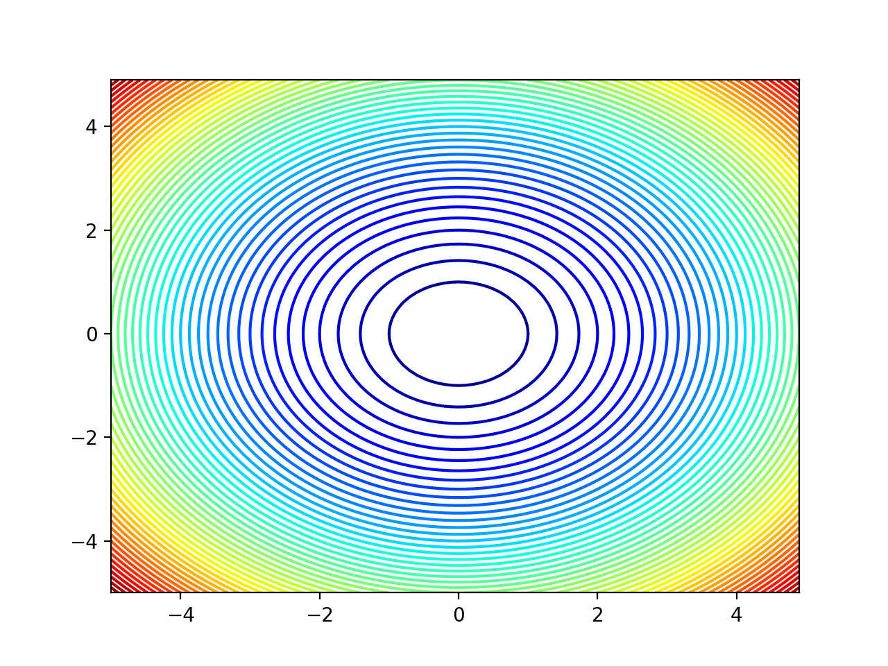
Contour Plot of a Two-Dimensional Objective Function
Filled Contour Plot of Test Function
It is also helpful to color the plot between the contours to show a more complete surface.
Again, the colors are just a simple linear interpolation, not the true function evaluation. This must be kept in mind on more complex functions where fine detail will not be shown.
We can fill the contour plot using the contourf() version of the function that takes the same arguments.
...
# create a filled contour plot with 50 levels and jet color scheme
pyplot.contourf(x, y, results, levels=50, cmap='jet')
We can also show the optima on the plot, in this case as a white star that will stand out against the blue background color of the lowest part of the plot.
...
# define the known function optima
optima_x = [0.0, 0.0]
# draw the function optima as a white star
pyplot.plot([optima_x[0]], [optima_x[1]], '*', color='white')
Tying this together, the complete example of a filled contour plot with the optima marked is listed below.
# filled contour plot for 2d objective function and show the optima
from numpy import arange
from numpy import meshgrid
from matplotlib import pyplot

# objective function
def objective(x, y):
	return x**2.0 + y**2.0

# define range for input
r_min, r_max = -5.0, 5.0
# sample input range uniformly at 0.1 increments
xaxis = arange(r_min, r_max, 0.1)
yaxis = arange(r_min, r_max, 0.1)
# create a mesh from the axis
x, y = meshgrid(xaxis, yaxis)
# compute targets
results = objective(x, y)
# create a filled contour plot with 50 levels and jet color scheme
pyplot.contourf(x, y, results, levels=50, cmap='jet')
# define the known function optima
optima_x = [0.0, 0.0]
# draw the function optima as a white star
pyplot.plot([optima_x[0]], [optima_x[1]], '*', color='white')
# show the plot
pyplot.show()
Running the example creates the filled contour plot that gives a better idea of the shape of the objective function.
The optima at [x=0, y=0] is then marked clearly with a white star.
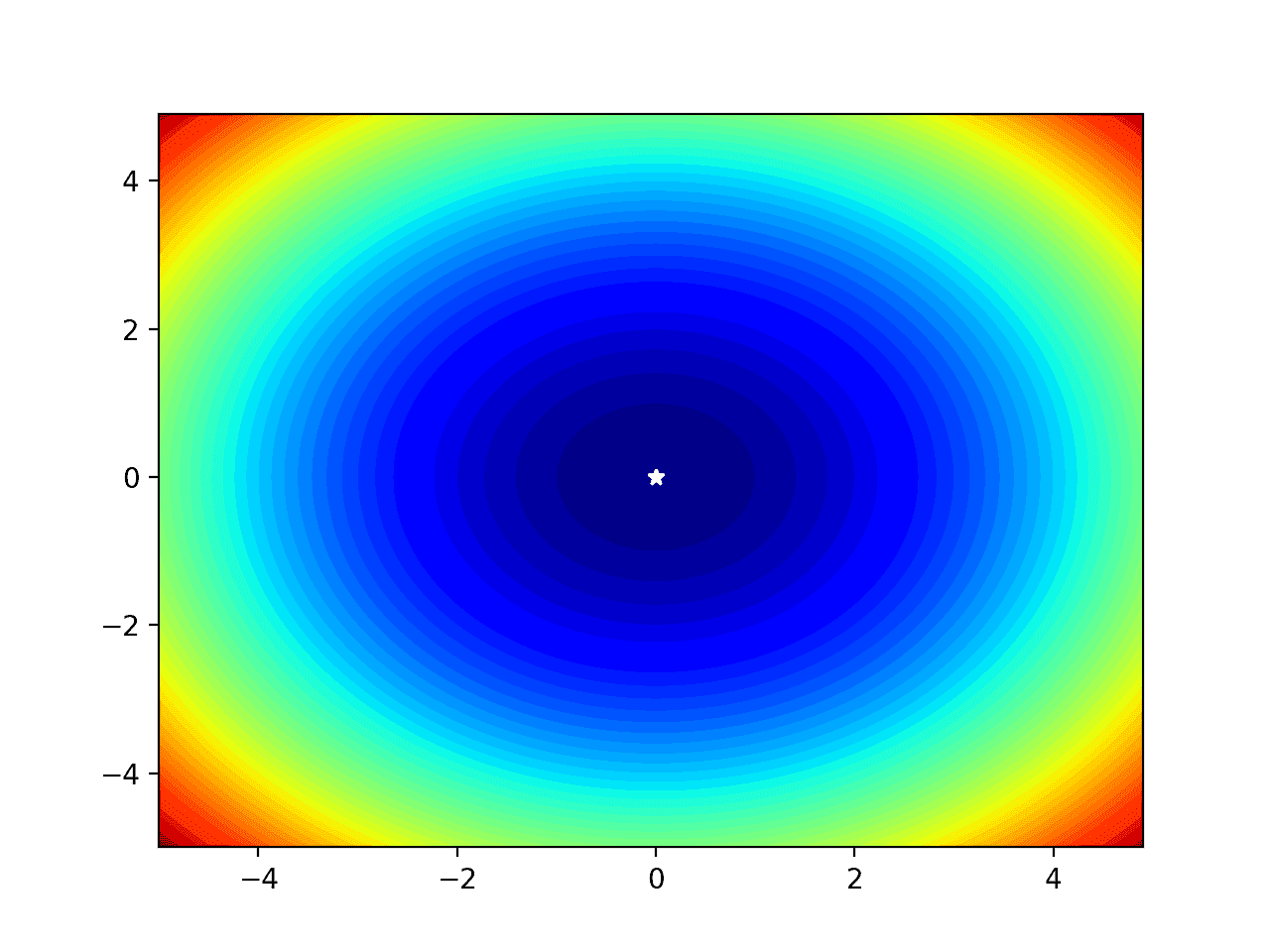
Filled Contour Plot of a Two-Dimensional Objective Function With Optima Marked by a White Star
Filled Contour Plot of Test Function with Samples
We may want to show the progress of an optimization algorithm to get an idea of its behavior in the context of the shape of the objective function.
In this case, we can simulate the points chosen by an optimization algorithm with random coordinates in the input space.
...
# simulate a sample made by an optimization algorithm
seed(1)
sample_x = r_min + rand(10) * (r_max - r_min)
sample_y = r_min + rand(10) * (r_max - r_min)
These points can then be plotted directly as black circles and their context color can give an idea of their relative quality.
...
# plot the sample as black circles
pyplot.plot(sample_x, sample_y, 'o', color='black')
Tying this together, the complete example of a filled contour plot with optimal and input sample plotted is listed below.
# filled contour plot for 2d objective function and show the optima and sample
from numpy import arange
from numpy import meshgrid
from numpy.random import seed
from numpy.random import rand
from matplotlib import pyplot

# objective function
def objective(x, y):
	return x**2.0 + y**2.0

# define range for input
r_min, r_max = -5.0, 5.0
# sample input range uniformly at 0.1 increments
xaxis = arange(r_min, r_max, 0.1)
yaxis = arange(r_min, r_max, 0.1)
# create a mesh from the axis
x, y = meshgrid(xaxis, yaxis)
# compute targets
results = objective(x, y)
# simulate a sample made by an optimization algorithm
seed(1)
sample_x = r_min + rand(10) * (r_max - r_min)
sample_y = r_min + rand(10) * (r_max - r_min)
# create a filled contour plot with 50 levels and jet color scheme
pyplot.contourf(x, y, results, levels=50, cmap='jet')
# define the known function optima
optima_x = [0.0, 0.0]
# draw the function optima as a white star
pyplot.plot([optima_x[0]], [optima_x[1]], '*', color='white')
# plot the sample as black circles
pyplot.plot(sample_x, sample_y, 'o', color='black')
# show the plot
pyplot.show()
Running the example, we can see the filled contour plot as before with the optima marked.
We can now see the sample drawn as black dots and their surrounding color and relative distance to the optima gives an idea of how close the algorithm (random points in this case) got to solving the problem.
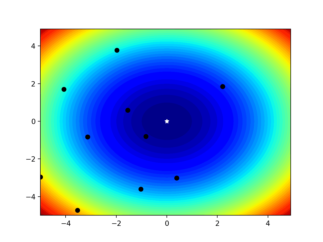
Filled Contour Plot of a Two-Dimensional Objective Function With Optima and Input Sample Marked
Surface Plot of Test Function
Finally, we may want to create a three-dimensional plot of the objective function to get a fuller idea of the curvature of the function.
This can be achieved using the plot_surface() Matplotlib function, that, like the contour plot, takes the mesh grid and function evaluation directly.
...
# create a surface plot with the jet color scheme
figure = pyplot.figure()
axis = figure.gca(projection='3d')
axis.plot_surface(x, y, results, cmap='jet')
The complete example of creating a surface plot is listed below.
# surface plot for 2d objective function
from numpy import arange
from numpy import meshgrid
from matplotlib import pyplot
from mpl_toolkits.mplot3d import Axes3D

# objective function
def objective(x, y):
	return x**2.0 + y**2.0

# define range for input
r_min, r_max = -5.0, 5.0
# sample input range uniformly at 0.1 increments
xaxis = arange(r_min, r_max, 0.1)
yaxis = arange(r_min, r_max, 0.1)
# create a mesh from the axis
x, y = meshgrid(xaxis, yaxis)
# compute targets
results = objective(x, y)
# create a surface plot with the jet color scheme
figure = pyplot.figure()
axis = figure.gca(projection='3d')
axis.plot_surface(x, y, results, cmap='jet')
# show the plot
pyplot.show()
Running the example creates a three-dimensional surface plot of the objective function.
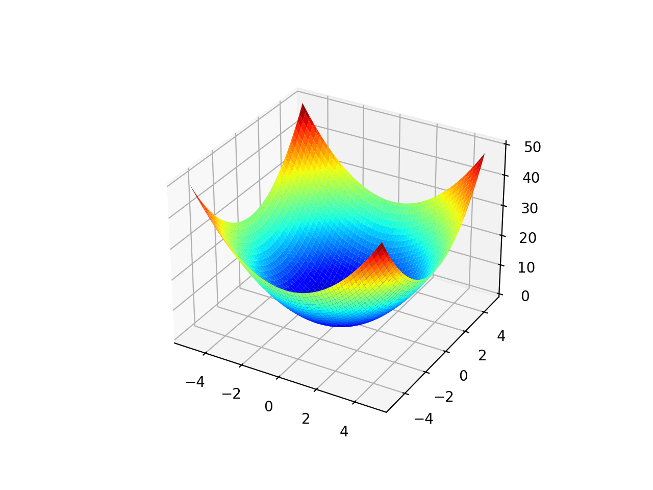
Surface Plot of a Two-Dimensional Objective Function
Additionally, the plot is interactive, meaning that you can use the mouse to drag the perspective on the surface around and view it from different angles.
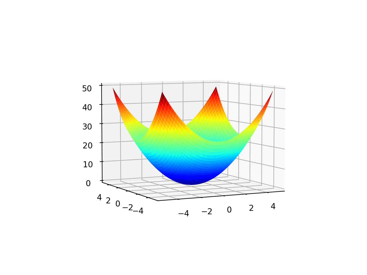
Surface Plot From a Different Angle of a Two-Dimensional Objective Function
Further Reading
This section provides more resources on the topic if you are looking to go deeper.
APIs
- Optimization and root finding (scipy.optimize)
- Optimization (scipy.optimize)
- numpy.meshgrid API.
- matplotlib.pyplot.contour API.
- matplotlib.pyplot.contourf API.
- mpl_toolkits.mplot3d.Axes3D.plot_surface API.
Articles
Summary
In this tutorial, you discovered how to create visualizations for function optimization in Python.
Specifically, you learned:
- Visualization is an important tool when studying function optimization algorithms.
- How to visualize one-dimensional functions and samples using line plots.
- How to visualize two-dimensional functions and samples using contour and surface plots.
Do you have any questions?
Ask your questions in the comments below and I will do my best to answer.
The post Visualization for Function Optimization in Python appeared first on Machine Learning Mastery.
